
.avif)
.svg)

Should you use Flat UI Colors in 2025?
Flat UI Colors? It's the kind of tool every designer is bound to have come across at some point, a reference for simple, effective flat color palettes. But in 2025, is it still a good idea to use it for your visual creations? Simplicity, functionality, limits... I've been using Flat UI Colors for several years now, and here I share my feedback and objective opinion on its real usefulness for your needs.
My experience with Flat UI Colors
For as long as I've been working on the web, Flat UI Colors has become one of my must-have reflexes. I've been using it for years, whether for quick prototypes at Easy Web or to inspire customer visual identities. What I love most of all is its simplicity in choosing harmonious, up-to-date palettes.
To start a project, quickly prototype an interface, or simply find a visual direction, it's a major asset. The colors offered are modern and designed to match naturally, avoiding errors of taste from the very first drafts.
For a quick start on a project, or simply to find a visual direction, it's a major asset.
However, it's not an exhaustive solution. It remains an inspirational tool, a starting point. For advanced needs such as design systems, advanced colorimetric exploration or WCAG accessibility testing, you'll need to turn to more comprehensive platforms.
It's not a complete solution.
Is Flat UI Colors really useful for my needs?
The real question before using Flat UI Colors is: what's your objective? Its relevance depends very much on usage. Its role? The rapidity of inspiration for 'flat' projects. You need a simple, coherent palette, without wasting time? It's your ally. For me, it's the perfect tool for a quick visual sketch or an instant creative boost.
Whether you're a front-end developer on an MVP, a junior designer looking for colorimetric basics, or a solo entrepreneur refreshing his landing page, Flat UI Colors is frighteningly effective. For a quick prototype, a customer mock-up to be validated, or immediate colors, you save precious time. It's the tool that helps you move forward quickly, without drowning in choices.
Its other major advantage? Its disarming simplicity. Zero learning curve, zero superfluous. The tool takes the mental burden of chromatic decision-making off your shoulders when your priority is speed and a clean, no-frills rendering. That's efficiency in its purest form.
Is Flat UI Colors suitable for beginners?
For a beginner starting out in design, Flat UI Colors is a bit like the ideal co-pilot, the one who saves you from the paralysis of the blank page. You know that moment when you don't know where to start with colors? This tool removes that barrier. It instantly provides you with pre-selected, consistent palettes, perfect for a quick first mock-up, a simple website or even a customer presentation. No more wasting hours searching for the right hue, you can concentrate on the structure.
It's a real learning gas pedal. By using Flat UI Colors, you naturally integrate design and colorimetry principles without even realizing it. You learn the power of harmonious colors by applying them directly, without being overwhelmed by complex theory. For quick projects or prototypes, it ensures professional visual consistency. It's an excellent springboard for understanding the basics and quickly gaining confidence in your color choices.


How much does Flat UI Colors cost?
The budget, we know, is a critical line, especially when you're running an agency or freelancing. But with Flat UI Colors, it's simple: the question of cost simply doesn't arise. This tool is entirely free, and that's its great strength.
There are no premium packages or subscription levels here. Flat UI Colors is an open-source resource, designed to be accessible to 100% of the design community. Whether you're a seasoned UX/UI designer, a web agency looking to optimize expenses, or even a student just starting out, you get access to ready-to-use color palettes at no extra cost. It's a real helping hand to get started quickly and successfully, without having to worry about your wallet. That's the power of sharing in our business.
What are the key features of Flat UI Colors?
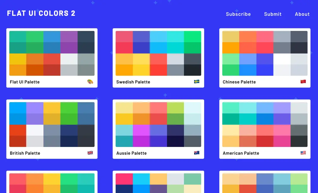
You know, choosing the right color palette is often a headache for me and my teams at Easy Web. The major strength of Flat UI Colors lies in its disconcerting simplicity. The tool immediately offers you a collection of colors designed for "flat design", so harmonious and modern, without you having to delve into hours of color theory. It's an invaluable asset for quickly launching mock-ups or prototypes with a solid, coherent aesthetic base, a not inconsiderable time-saver when sprints are short.
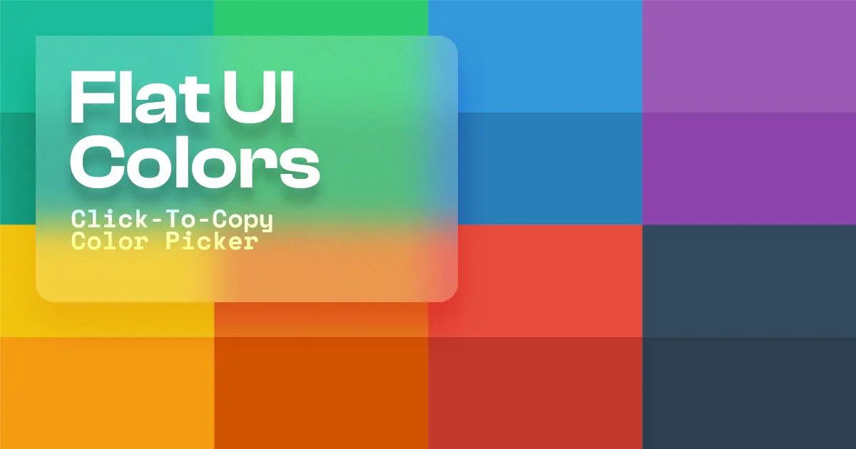
But where Flat UI Colors really becomes an indispensable ally is with its instant copy function. Imagine: one click on the color of your choice, and its HEX, RGB or RGBA code is directly into your clipboard. No more tedious manual selections or input errors! This efficiency is crucial to the integration of our designs. It smoothes the transition from design to implementation, allowing designers and developers to work hand in hand without a hitch, and that, believe me, changes everything.
Accessibility is non-negotiable in 2025. Flat UI Colors, despite its apparent simplicity, incorporates a crucial feature: contrast checking. For us at Easy Web, this is a huge time-saver. No more juggling between external tools to ensure that our texts remain legible against any background. You select a color, and bang, it tells you its WCAG (Web Content Accessibility Guidelines) compliance, saving you painful customer feedback or user experience problems.
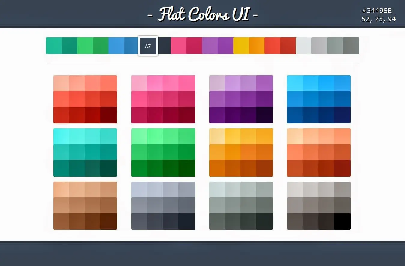
.What makes Flat UI Colors really useful for an agency like ours is its export flexibility. You can copy HEX or RGB codes, of course, but the tool goes further. It can export the palette in various formats, such as SCSS or LESS variables. This is a detail that changes everything for the front-end developer. No more manual copy-and-paste errors, handovers become fluid, and graphic charter integration is impeccable first time.
Flat UI Colors is great for getting started quickly, but I quickly saw its limitations on more demanding projects. If you need to respect a complex graphic charter, manage multiple color states (hover, active, etc.) or ensure strict compliance with accessibility standards (WCAG), its fixed palettes quickly become a hindrance. It is not designed to generate dynamic color systems or fine nuances.
.For these precise scenarios, tools like Coolors or Adobe Color are better suited, offering true exploration and generation of complex palettes, sometimes even with built-in accessibility checks. They give you that depth that Flat UI Colors can't. But be warned, Flat UI Colors remains unbeatable for ultra-fast prototyping or bringing an MVP to life in the blink of an eye.
So, to sum up my opinion of Flat UI Colors:
Advantages:
- Fast implementation.
- Disconcertingly easy to use.
- Perfect for wireframes and MVP.
Disadvantages:
- Lack of flexibility for demanding projects.
- Limitations on advanced accessibility.
- Little control over specific shades.
FAQS
Is it reliable and secure?
Absolutely. Flat UI Colors is a static resource, reliable by nature: it provides constant hexadecimal and RGB codes, without variation. In terms of security, the tool's simplicity is a major advantage. It collects no personal data and requires no connection or download, eliminating any risk of confidentiality or malware. It's a secure, consistent color library for all your design projects.
Is it compatible with my other tools?
Absolutely. This tool is designed for universality. It provides you with ready-to-use color codes (hexadecimal, RGB). You copy and paste them directly into most of your design software like Figma, Sketch, Adobe XD, Photoshop or even your code editors for CSS. No need for complex plug-ins or special integrations. It's this simplicity that makes it so effective at fitting naturally into all designer workflows, whatever ecosystem you're using.
Is there responsive customer support?
Honestly, for a tool like Flat UI Colors, we're not looking for traditional customer support. It's a simple, free resource, often maintained by a small team or a passionate developer. Instead, "responsiveness" manifests itself via community contributions or bug reports on platforms like GitHub. You won't have a hotline, but is it really necessary to copy and paste a color code? Its simplicity is its own support. We use it for its speed and reliability, not for complex after-sales.
.What do other users think?
Clearly, the majority of feedback has been very positive about its simplicity and speed. It's a real Swiss army knife for emergencies or rapid prototyping. Front-end developers appreciate its ease of integration. More experienced designers, on the other hand, who are looking for very specific palettes or extensive customization, can sometimes find it a little limiting. It's rarely used as the sole color source for a large-scale project, but rather as an excellent starting point or one-off support.
Can I easily change later?
Clearly, the majority of feedback has been very positive about its simplicity and speed. It's a real Swiss army knife for emergencies or rapid prototyping. Front-end developers appreciate its ease of integration. More experienced designers, on the other hand, who are looking for very specific palettes or extensive customization, can sometimes find it a little limiting. It's rarely used as the sole color source for a large-scale project, but rather as an excellent starting point or one-off support.
Alternatives
.svg)

Specializing in business creation, sales and digital marketing, he puts his expertise at the service of users to help them identify the solutions best suited to their needs. Passionate about digital innovation and optimizing online performance, Alexis is committed to providing detailed, transparent and unbiased comparisons.
Do you have an entrepreneurial project?
We support you in the structuring and development of your tech project. Make an appointment with one of our Business Strategists.