
.avif)
.svg)


Contrast quickly established itself as a pillar for validating color accessibility, a crucial issue for any self-respecting web designer. But in 2025, in a constantly changing ecosystem and faced with new tools, is Contrast still the right tool for your visual creations? Ease of use, depth of functionality or real limitations... After several years of putting it to the test on a daily basis, I hereby give you my complete and objective opinion on its concrete contribution to your projects.
My experience with Contrast
Frankly, Contrast has been part of my essential toolbox for years at Easy Web. We integrated it into our design processes very early on, long before accessibility became as central as it is in 2025. What really blew me away, and what I still appreciate so much, is its ability to make color accessibility child's play.
When it comes to WCAG compliance and inclusive design, contrast management is crucial. This tool lets us check at a glance whether our color choices comply with standards, directly from our design software. It's a huge time-saver and quality assurance for our final deliverables.
However, it doesn't do everything. Contrast is highly specialized, focusing solely on colors. For broader accessibility audits, encompassing typography, interactions or navigation, we'll of course have to turn to more comprehensive tools or in-depth manual reviews.
Contrast doesn't do everything.
Is Contrast really useful for my needs?
The real question to ask yourself before using Contrast is: what is my objective? Because the relevance of Contrast depends very much on how you use it. If your primary goal is to ensure that the color combinations in your design comply with WCAG accessibility standards, then yes, this is the tool for you. It excels in this area, without question.
Whether you're a UI/UX designer, an accessibility-conscious front-end developer, or the head of a web agency, Contrast is an indispensable ally. At Easy Web, we integrate it right from the design stage. For a new graphic charter or an audit of an existing site, it gives immediate feedback on the legibility of texts and interactive elements.
Its other strength is its ease of integration. No complex learning curve. It quickly becomes a natural extension of your daily workflow, validating your chromatic choices in the blink of an eye without hindering your creativity. Visual quality assurance, so to speak.

Is Contrast suitable for beginners?
When you're new to web design, accessibility can quickly seem like a headache. I see Contrast as a real ally for novices. It radically simplifies this complexity. Imagine being able to instantly check the contrast of a text against a background, or validate the legibility of a color palette with a single click. It alerts you to problems straight away, without you having to master all the WCAG standards from day one.
This tool is a real teaching platform. For a beginner, Contrast isn't just a checker; it's a silent mentor. It naturally pushes you towards more inclusive visual choices. By identifying precisely where and why a contrast is low, it helps you understand accessibility principles in the field. You learn by doing, and most importantly, you develop good habits that are just indispensable in 2025.


How much does Contrast cost?
Let's talk budget, a crucial point for any tool. Contrast's Free package is great for getting started. It offers the key functions of contrast analysis and color-blind simulation, ideal for students or freelancers exploring accessibility. An excellent entry point.
The Pro package, at €19/month, goes from strength to strength. You get access to direct integrations (Figma, Sketch, XD) and export of detailed reports. This is the tool I recommend to solo designers looking to professionalize their approach to accessibility on a daily basis.
Finally, for agencies, the Team offer at €59/month is strategic. It integrates real-time collaboration, shared dashboards and priority support. Indispensable for our team to guarantee maximum consistency and efficiency on all our customer projects.
Finally, for agencies, the Team package is strategic.
What are Contrast's key features?
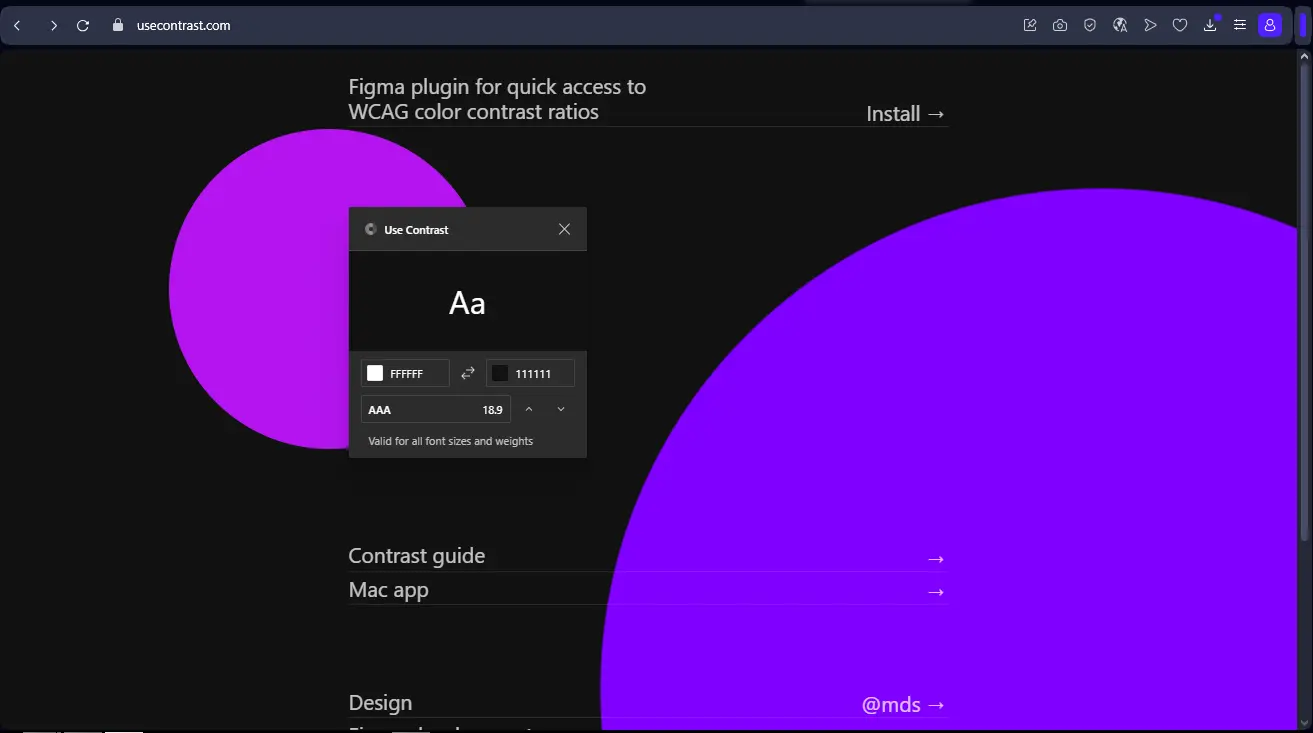
When I think of Contrast, the first thing that comes to mind is its ruthless precision on contrast ratios. The tool instantly validates your color combinations against the latest WCAG (Web Content Accessibility Guidelines) standards. No more doubts or tedious back-and-forth. You know in real time whether your design is inclusive and compliant, a time-saver and peace of mind invaluable to any agency.
What also makes it so powerful is its seamless integration with our favorite design tools. Whether we're working in Figma, Sketch or Adobe XD, Contrast nestles in unobtrusively and analyzes contrast directly on your artboards. This synergy is key to a smooth workflow. For us at Easy Web, this means integrating accessibility right from the first mock-ups, without ever breaking the creative rhythm.
When I started with Contrast, what really blew me away was its direct integration into my workflow. Forget the tedious back and forth. You work in Figma or Sketch, and Contrast gives you real-time feedback on the contrast of your elements. It's an instant verification of WCAG (Web Content Accessibility Guidelines) compliance, a huge time-saver and a reassurance for our deliverables. No more surprises
.But that's not all. The game-changer for me is the in-depth analysis of color palettes. Contrast doesn't just tell you "it doesn't look right". It goes further, intelligently suggesting adjustments, shades or alternative colors that respect accessibility standards. It's a personal assistant for creating inclusive visual harmonies, without sacrificing aesthetics. A real masterstroke, isn't it?
Contrast? Great tool for a specific purpose, but let's be honest, its limitations quickly become apparent when you go beyond pure WCAG ratios. If you're looking for a broader accessibility analysis - we're talking keyboard navigation, HTML semantics or status management - Contrast won't tell you a thing. Clearly, it's no substitute for a full interface audit.
.For these more extensive needs, I turn to solutions like AXE DevTools or the Lighthouse audit. They're designed for this purpose and complement Contrast perfectly. But keep in mind that for quick, surgical contrast auditing, Contrast is just unbeatable.
At the end of the day, here's what I take away:
Benefits:
- Disconcerting simplicity
- Absolute contrast precision
- Speed of execution
Drawbacks:
- Very limited range of action
- No overall accessibility analysis
- Does not dispense with other audits
FAQS
Is it reliable and secure?
Absolutely. Security is one of our top priorities at Easy Web, and Contrast is no exception. The tool uses robust end-to-end encryption for all your design data, guaranteeing its confidentiality. It also complies with the latest data protection regulations, such as the RGPD, which is essential in 2025. As for reliability, our teams have put it to the test: updates are frequent, stable, and performance remains consistent. It's a tool you can rely on for your day-to-day work.
Is it compatible with my other tools?
Absolutely. In 2025, a tool like Contrast has to be a good teammate. It integrates perfectly via dedicated plugins with the market leaders: Figma, Sketch and Adobe XD. This is crucial if you don't want to break your workflow. You can import, test and export your designs without friction. This interoperability is a real priority for us at Easy Web, and Contrast fulfills it well. It's the kind of detail that makes all the difference on a daily basis, you know.
Is there responsive customer support?
Frankly, we were pleasantly surprised by the responsiveness of Contrast support. When we had questions, especially on precise technical points, the feedback was there in less than 24 hours most of the time. This is a major asset for our teams, as it avoids getting stuck on a project. Their explanations are clear and to the point, a real plus for a pro solution.
What do other users think?
What I hear most often is unanimous praise for its ability to simplify WCAG validation. Designers love its speed and seamless integration into their everyday tools. No more manual calculations or tedious back-and-forth! I'm often told that it's become a reflex, an indispensable safeguard. Some would like more advanced features, but for contrast checking and accessibility, it remains the clear market reference in 2025.
Can I easily change later?
What I hear most often is unanimous praise for its ability to simplify WCAG validation. Designers love its speed and seamless integration into their everyday tools. No more manual calculations or tedious back-and-forth! I'm often told that it's become a reflex, an indispensable safeguard. Some would like more advanced features, but for contrast checking and accessibility, it remains the clear market reference in 2025.
Alternatives
.svg)

Specializing in business creation, sales and digital marketing, he puts his expertise at the service of users to help them identify the solutions best suited to their needs. Passionate about digital innovation and optimizing online performance, Alexis is committed to providing detailed, transparent and unbiased comparisons.
Do you have an entrepreneurial project?
We support you in the structuring and development of your tech project. Make an appointment with one of our Business Strategists.