
.avif)
.svg)

Should you use Material Design Color Tool in 2025?
Material Design Color Tool, since its inception, has established itself as an obvious reference for anyone embracing the Google ecosystem, offering a simple path to consistent color palettes. But with trends and frameworks rapidly evolving in 2025, is it still a relevant tool for our visual creations? Simplicity, functionality, limits... I've been using Material Design Color Tool on a daily basis for several years now. Here I share my feedback and objective opinion on its real usefulness for professionals, depending on your specific needs.
My experience with Material Design Color Tool
I've had the Material Design Color Tool permanently open in my tabs for a few years now. It's become an indispensable resource for me, not least for its ability to guarantee the accessibility of our palettes.
This tool really shines when we need to build a color harmony that complies with WCAG standards, essential for our application and site projects that aim for inclusion. It allows you to validate readability in the blink of an eye, which is a huge time-saver.
On the other hand, if you're looking for total creative freedom, or if you're working on brand identities far removed from Material codes, his recommendations can sometimes be a little rigid. He's excellent within his framework, but less versatile for pure experimentation.
Is the Material Design Color Tool really useful for my needs?
The real question to ask yourself before using Material Design Color Tool is: what's my purpose? Because its relevance depends on usage. The tool excels at generating coherent color palettes that comply with Material Design guidelines. To lay the visual foundation for a new app or site, it's a formidable starting point.
Whether you're a UI/UX designer, front-end developer or project manager, the tool saves you an incredible amount of time. Quickly define primary and secondary colors, generate all shades and check contrast accessibility. Ideal for a project kick-off or to validate an agency's artistic direction.
Another major asset is its focus on accessibility. The tool guides you in choosing sufficient contrasts, a step often overlooked. This simplifies compliance with WCAG standards, essential for inclusive, modern interfaces in 2025.
Is the Material Design Color Tool suitable for beginners?
You're getting into the business of creating color palettes, and it can quickly turn into a headache when you're just starting out. The Material Design Color Tool is your personal mentor. It guides you step by step, with clear design rules built in. It's impossible to get lost: you explore tried-and-tested palettes, instantly visualizing how your color choices behave on different UI elements, from text to buttons. It's ideal for understanding the basics without getting overwhelmed.
This tool is a real springboard. It doesn't let you improvise: it validates the conformity of your combinations in real time, particularly for accessibility - a crucial point often overlooked by novices. For a designer in training or someone migrating to digital, it's the assurance of starting on the right footing and creating coherent, functional interfaces, without spending hours groping.


How much does Material Design Color Tool cost?
Wondering how much this indispensable tool costs? Excellent question! We often talk about investment in our design tools, but with the Material Design Color Tool, the answer is simple: zero euros. Yes, you read that right. Google makes this powerful resource available to us free of charge.
This is a major advantage, whether you're a freelance designer on a tight budget, a growing startup, or even an established agency like ours. No cost doesn't mean limited functionality - quite the contrary. You get access to all pallet creation, accessibility testing and preview options without paying a cent. No à la carte packages, no hidden subscriptions. Total freedom to experiment and guarantee perfect consistency of your Material Design interfaces. Frankly, it's one of those gifts you don't turn down in our business.
What are the key features of Material Design Color Tool?
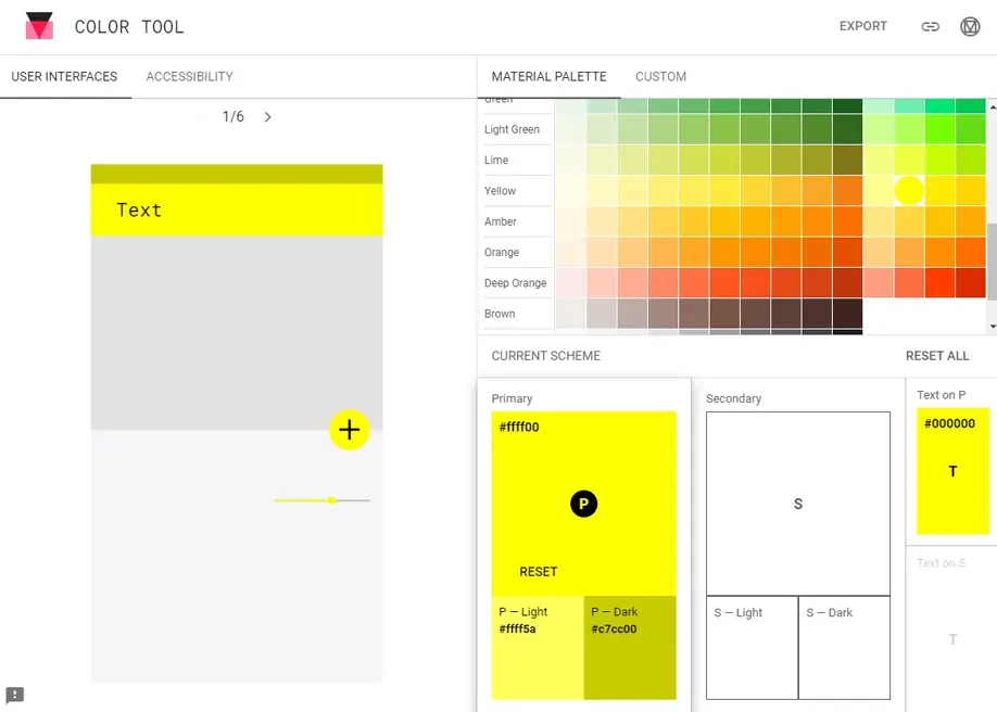
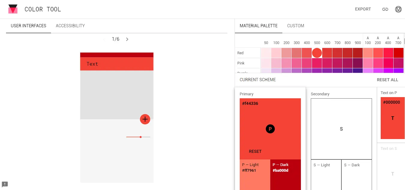
When launching a new project, visual consistency is paramount. What I immediately appreciate about the Material Design Color Tool is its ability to generate color palettes in perfect accord with Google guidelines. No more hours spent groping for the right hue; you select your primary and secondary colors, and the tool displays the whole range with the exact values. For us at Easy Web, it's a huge time-saver right from the initial design phases, guaranteeing perfect harmonization across all our interfaces.
But the innovation doesn't stop there. Beyond simple generation, the tool integrates a valuable feature: real-time preview on typical user interface (UI) elements, and above all, an accessibility check. How many times have we had to go back over color choices to ensure sufficient contrast? With this tool, you get immediate feedback on the contrast ratio for text to background, ensuring compliance with WCAG standards. It's an indispensable safety net for delivering inclusive, compliant designs.
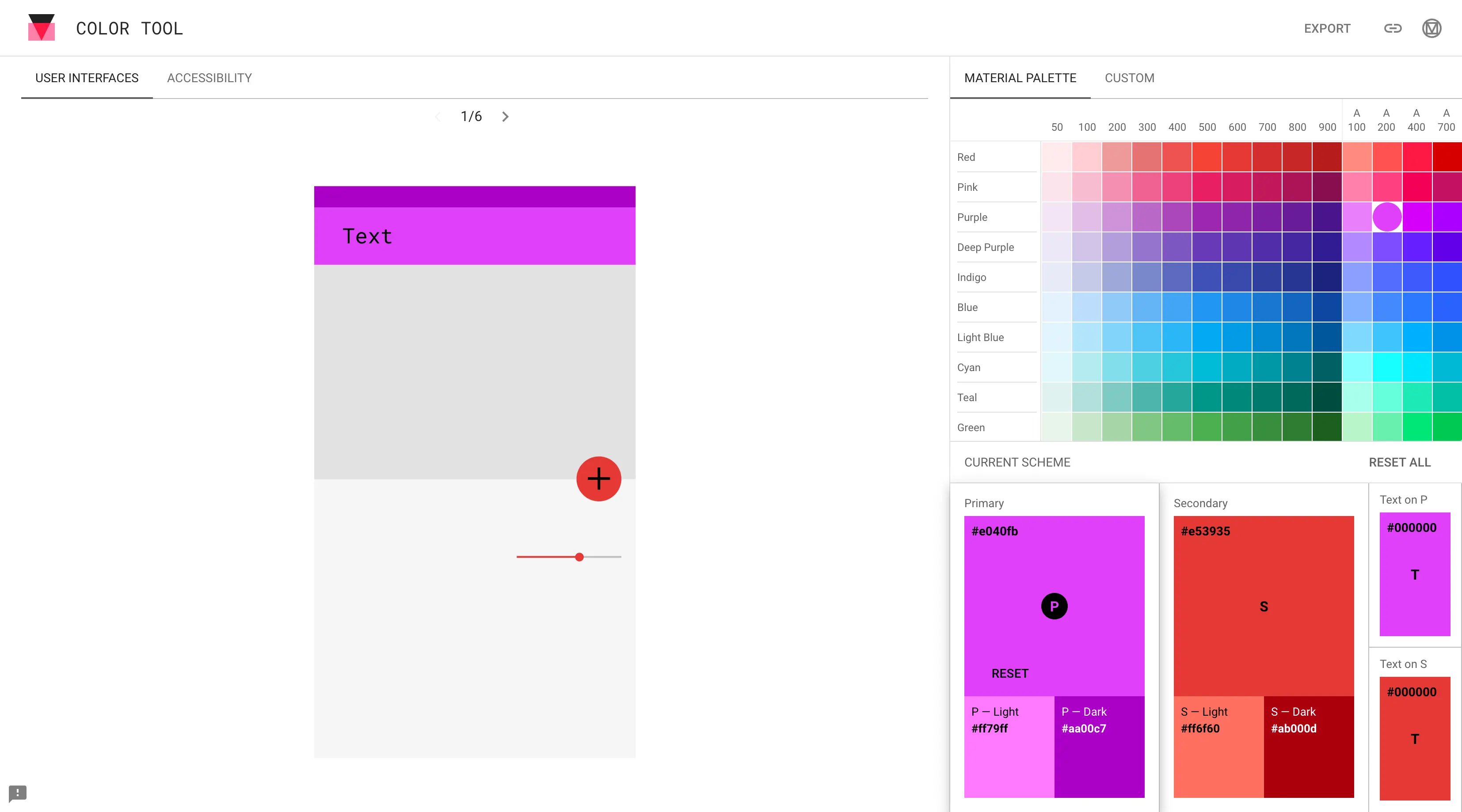
One of Material Design Color Tool's major assets is clearly its built-in accessibility checker. No more guesswork! The tool analyzes the contrast ratios between your text and background colors in real time, telling you whether they comply with WCAG standards. In 2025, compliance is non-negotiable. We can no longer afford to let users down because of poor contrast, it's just unthinkable for an agency.
Beyond compliance, I particularly appreciate the visualization of the palette on a typical Material Design interface. It lets you immediately project the final rendering of your color choices onto UI elements like buttons, cards or application bars. It's a huge time-saver when it comes to validating an artistic direction, and it avoids costly round-trips with development. It's concrete, directly integrated into the design process.
Frankly, the Material Design Color Tool is great for Material projects, but it quickly shows its limits. For a truly unique graphic charter, or very specific accessibility needs beyond basic WCAG, you'll quickly feel the vice. Free exploration and extensive customization are its weak points, as I've experienced.
.That's when you naturally turn to tools like Coolors or Adobe Color, which offer more freedom. But don't throw out the Material Design Color Tool! For the designer who wants a clean, fast Material base, it remains a strong ally. It excels in its niche, that's for sure.
So, the balance sheet is clear:
Advantages:
- Simplicity and speed for Material Design.
- Perfect integration with the Google ecosystem.
- Integrated accessibility basics.
Disadvantages:
- Lack of flexibility outside Material.
- Limited functionality for advanced exploration.
- Not well suited to complex charts.
FAQS
Is it reliable and secure?
Totally. Since it's designed and maintained by Google, this tool benefits from their state-of-the-art technical infrastructure and security protocols. You have no sensitive data to entrust to it; it simply generates and displays your color choices. It's a reliable, stable environment for all your color explorations, with no ulterior motives. It runs like clockwork, so you can go in with your eyes closed.
Is it compatible with my other tools?
Clearly, its strength is integration. You generate your palettes, and color code exports - hex, RGB, HSL - are immediate. You can use them directly in Figma, Sketch or Adobe XD. For dev, copy and paste into your SCSS or CSS variables, and you're in business as usual. No more manual conversions. It's designed to fit seamlessly into your existing workflows, without friction. A real time-saver for us at Easy Web every day.
.Is there responsive customer support?
Look, to be blunt: as a Google tool, the Material Design Color Tool doesn't offer responsive customer support in the traditional sense, like a hotline or ticket system. We rely mainly on the excellent official Material Design documentation, the Google Developers community forums, and resources shared by other designers. It's a community approach, not direct customer service. At Easy Web, we manage this by ensuring that our teams are well-versed in the tools and know where to look for information. Rely on the community and the doc, not a dedicated after-sales service.
What do other users think?
In our discussions with other agencies and designers, most praise its simplicity and effectiveness for material-friendly palettes. The integration of accessibility rules (the famous contrast!) is often highlighted as a huge plus. The downside, for some, is a lack of flexibility for out-of-the-box designs. But for a solid, coherent base, the consensus is rather very positive.
Can I easily change later?
In our discussions with other agencies and designers, most praise its simplicity and effectiveness for material-friendly palettes. The integration of accessibility rules (the famous contrast!) is often highlighted as a huge plus. The downside, for some, is a lack of flexibility for out-of-the-box designs. But for a solid, coherent base, the consensus is rather very positive.
Alternatives
.svg)

Specializing in business creation, sales and digital marketing, he puts his expertise at the service of users to help them identify the solutions best suited to their needs. Passionate about digital innovation and optimizing online performance, Alexis is committed to providing detailed, transparent and unbiased comparisons.
Do you have an entrepreneurial project?
We support you in the structuring and development of your tech project. Make an appointment with one of our Business Strategists.