.avif)
.svg)

Table of Contents
Published on
5/3/26
-
5 min
A landing page is a web page built for a single purpose: to convert a visitor into a lead or customer via a clearly identified call to action. If you want to take your design and optimization further, check out our dedicated landing page creation service for comprehensive, tailor-made support.
To help you understand what a landing page is, you can watch this video. It will give you a concrete idea of how it works, best practices to follow, and mistakes to avoid in order to maximize your conversions.
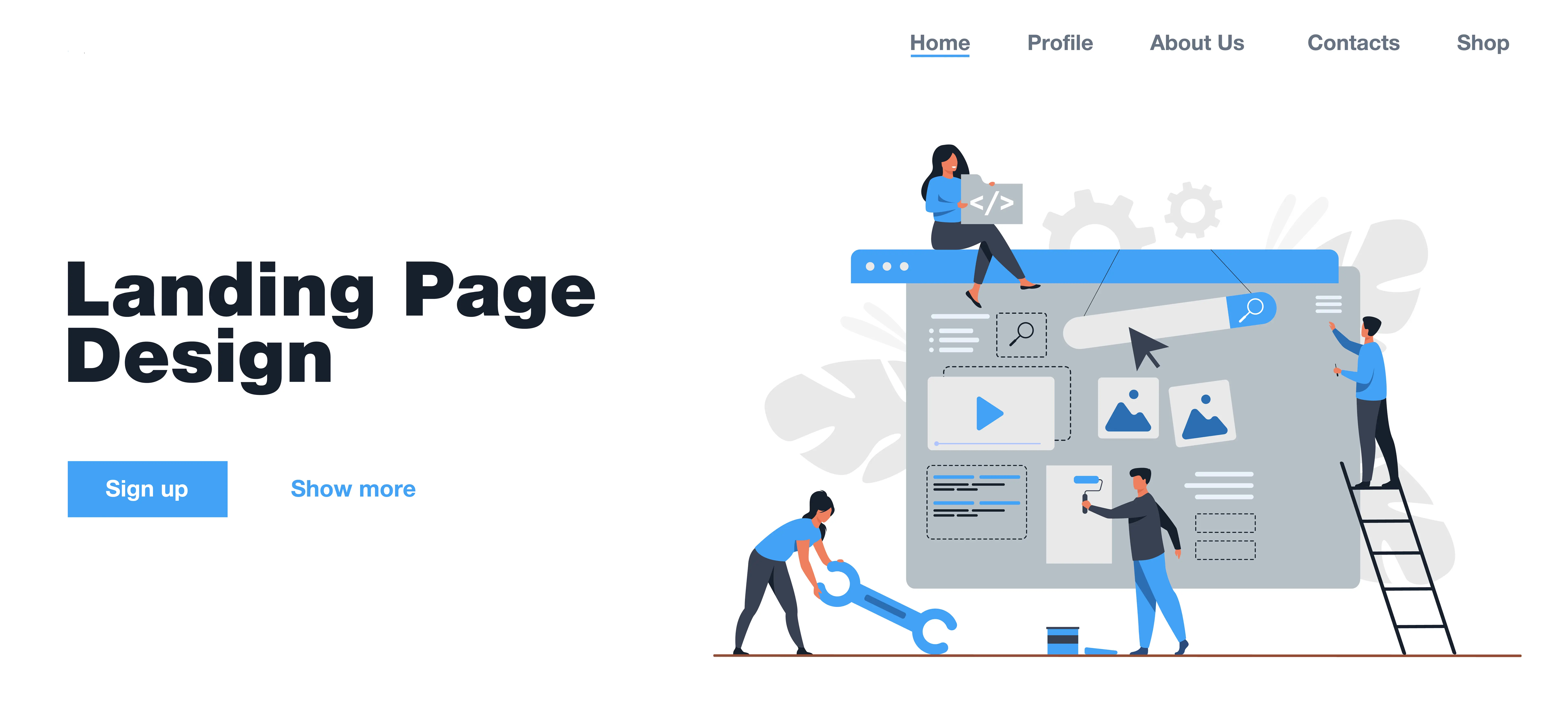
A landing page differs from the traditional pages on your website: it focuses on a specific goal (registration, download, contact, etc.) and eliminates any unnecessary navigation. The approach is clear: capture attention and encourage a single action, without distraction. In inbound marketing, it is essential for converting targeted traffic into qualified leads, and often generates a better ROI than standard showcase pages.
The objective of a landing page is always related to conversion. In general, it allows you to collect useful information via a form (a lead), or to lead directly to a purchase or contact. It often targets an audience from specific campaigns: emailing, online advertising, social networks, etc. Each landing page is designed as a simple and optimized conversion point.
Unlike traditional pages, which have multiple objectives (inform, navigate, guide), landing pages are transparent: a single page, a single objective, a single CTA. This distinction reduces distractions for the user. By removing menus and external links, the page focuses attention on the desired action. HubSpot even claims that incorporating a relevant video can increase conversion rates by up to 80%.
Always start with a powerful headline and a benefit-focused tagline. Visitors should immediately understand what they gain by following your CTA.
Visuals (photos, videos, icons) reinforce understanding and engagement. According to HubSpot, a landing page that includes a video can significantly improve conversion rates. The content should also present your arguments clearly, concisely, and directly.
The action button or form must be clearly distinct, visible, and repeated in several places if the page is long. HubSpot strongly recommends offering only one CTA so as not to dilute attention.
The form is the conversion hub of the page. It should request the minimum amount of information to maximize the completion rate. Also, consider adding a GDPR notice depending on your audience.
Add customer testimonials, partner logos, or performance indicators (e.g., "over X downloads"). These elements build trust and encourage action.
A/B testing is essential: change a headline, visual, or CTA and compare performance. HubSpot emphasizes its central role in continuous improvement.
To help you better understand what a landing page is, you can watch this video. It will give you a concrete idea of how it works, best practices to follow, and mistakes to avoid in order to maximize your conversions.
Conclusion
Landing pages are a powerful tool for your digital campaigns: they focus attention, simplify the user journey, and promote conversion. To learn more, explore our related articles:
How to create a landing page that really converts?
Which tool should you choose to create a landing page? Webflow, WordPress, or something else?
Ready to design high-performing landing pages? Our Easyweb team is here to help you optimize every conversion.